
[ad_1]
As well as giving us our first official look at Android 12, Google I/O 2021 also marked the rollout for the first public beta of the company’s next mobile OS release; a beta that we’ve since downloaded onto a Pixel 5 to road test for you.


If you want to download the May Android 12 beta release for yourself, make sure you have a compatible device and head on over to our ‘How to download Android 12 Beta’ article, for a comprehensive walkthrough.
In Google’s own words, Android 12 centres around “a new UI that adapts to you, improving performance, with privacy and security at the core.”
While privacy and security enhancements are always appreciated, the new user interface – dubbed ‘Material You’ – is easily the most prominent shift compared to Android 11, and probably one of the most substantial visual overhauls to Android across the last few generations.
After three developer previews, this May update serves as the first of four public betas marked on Google’s roadmap to Android 12’s official release (expected September 2021, alongside the Pixel 6) and as such, doesn’t pack in all the features promised as part of I/O 2021, more will follow.
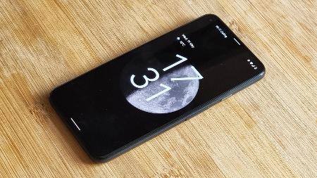
New clock
Once downloaded and installed (on the Pixel 5 we were using to test beta 1, the download clocked in at 1.88GB), the first thing you’ll encounter is the new lock screen and lock screen clock.
Android 11 lock screen (left), Android 12 lock screen (right)
Material You manifests in a number of ways, from new rounded UI elements to richer interaction animations. If you use the Pixel’s always-on display function, you’ll notice that – provided you don’t have any unread notifications – the clock sits front and centre.
Waking the device pushes the font used by the clock to transition from fine to bold, and hints at what to expect from the rest of this new Material You-driven experience.
Rounded corners
Google has seen fit to allow UI elements to take up far more room on-screen than on previous builds of Android, meaning information – be it icons or text – has a little more room to breathe, at the expense of being able to display as many disparate pieces of information (without scrolling or swiping to reveal more).
Android 11 & 12 PIN entry screens (left, middle), Android 12 rounded widget (right)
Rounded corners feature on elements like the apps drawer, certain widgets, notifications, quick settings, apps in the multitasking view and beyond. Notifications of similar types form rounded rectangle blocks, with the radius of the corners increasing should you break out a notification from a block (such as when swiping to dismiss one).
If you use a PIN to secure your lock screen, the circular numbers of the keypad briefly morph into squares with rounded corners when you tap on them too.
Quick settings
The new quick settings area now only shows four controls by default (it previously showed six), but offers up more room for pertinent information from each – meaning you can more readily glance to see which WiFi network or Bluetooth device you’re connected to.
Android 11 quick settings (left), Android 12 quick settings (right)
The brightness slider is now emboldened too, requiring less precision to hit with a fingertip for a quick adjustment (and it’s a similar story with the UI’s new volume controls as well).
Hold for Assistant
While not enabled by default, pressing and holding the power button can now summon the Google Assistant. If enabled (from within Settings) this replaces the current card that throws up Google Pay, smart home devices and power controls, but having the Assistant available by way of a hardware button – rather than just on-screen gestures or voice – will undoubtedly appeal to some users.
Settings, sparkles & splash screens
The Settings menu is visually clearer too, with a dark rounded search bar against a lighter grey background (the inverse of Android 11), complete with larger icons and text (this time without any subheadings), as well as greater spacing between menu items.
Tapping on items (not just within Settings – although the effect is most prominent here) also produces a brief ‘sparkle’ animation that radiates out quickly from the centre of the UI element you’re interacting with, adding to the playful feel of Material You’s changes.
Android 12 settings (left), sparkle detail (middle), app splash screen (right)
As detailed in our Android 12 explainer, tapping on an app now brings up a splash screen momentarily. Some app icons don’t format correctly at present, but Google is aware of the issue.
Splash screens are standard on Android 12 but developers can customise what image shows up, have the splash screen colours adhere to device dark mode or theme settings, and even include animations.
Finally, a one-handed mode
One-handed mode is one of those features that other manufacturers have included within their modified Android builds for so long that it’s a wonder Google didn’t catch on sooner.
Android 12 one-handed mode
As it stands, a swipe down from the bottom edge of the screen (once enabled) quickly shifts whatever’s on-screen down by about 45%. Rather than scaling the entirety of the UI down (as on the likes of Samsung’s and Motorola’s Android phones), Google’s opted for an iOS-like Reachability alternative; pulling UI elements usually positioned along the top edge of the screen, down to within reach.
What isn’t yet available within Android 12 beta 1?
For everything that the May beta does to revamp the Android experience, a few key Android 12 features are still to be instated.
Missing widgets
Google showed off a bevvy of new widget designs at I/O 2021 and while certain widgets already embrace elements like the rounded corners of Material You, reworked entries like a new clock and weather widget design remain absent.
Colour-matched themes
Referred to as ‘Material palettes’, Android 12 will use AI-managed colour science to adjust the accent colours of UI elements, so that they complement your chosen wallpaper. Right now, elements like the lock screen and quick settings buttons all remain a light blue (assuming you’re using the Default style), regardless of wallpaper.
Back tap
One of the long-rumoured features of Android 12 was ‘back tap’. While ‘Double Tap’ – as it’s actually called within the May beta – does feature, it isn’t yet active (even though there’s a toggle to turn it on).
The image that’s used to demonstrate the feature is clearly temporary at this stage but the setting does feature controls to serve as a new means of taking a screenshot, opening the Google Assistant, playing and pausing media, seeing recent apps, opening notifications or opening an app of your choosing.
Everything else
There are a number of under-the-hood improvements that it’s harder to test for at present, along with features like Approximate Location, but we’ll keep abreast of each new public beta to see what additional features and improvements Google makes to Android 12 in the run-up to release.
Should you download Android 12 beta 1?
If you’re thinking of downloading this first Android 12 public beta, there are a few things to consider before doing so.
Just as Google always says with any of its beta releases, this is unfinished firmware and comes with bugs, incomplete features and more instabilities than a standard release of Android. As such, consider whether you’re happy living with such risks, especially if you intend to install the beta on your main device.
Based on our first experiences with it, it seems usable enough for everyday tasks, with only a few UI quirks and issues here and there. Fundamentals like connectivity, audio, camera and touch functionality all appear to be intact.
Considering what Android 12 promises, it’s probably worth holding off until at least the next beta release (expected in June) anyway, as it’ll likely include more of the functionality that’s been teased from the final official release, destined to grace devices later this year.
[ad_2]
Source link
